I’d like to share a few favourite movie poster designs from around the globe.
This artform is almost as old as cinema itself. Parisian painter and lithographer Jules Chéret is credited with the first artwork designed specifically for the purpose of advertising a film programme.
But Bass Otis in America, and Toulouse-Lautrec and Alphonse Mucha in Europe, had already been using their considerable talents to make eye-catching imagery to sell showbusiness years before the advent of moving pictures.
From silents to talkies
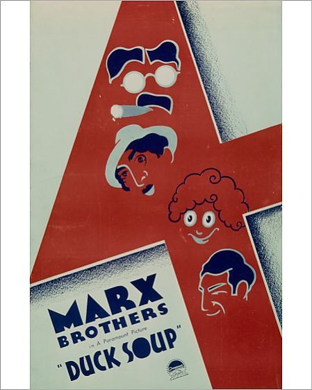
I guess the earliest film poster art most of us have been even casually exposed to would have been those from the beginning of Hollywood’s golden age, when silents were about to give way to the talkies.
The prevalent style typically sees an artist use an expressive image of a film’s stars, either a colourised photo or painting, emblazoned with bold, bright lettering.
They can be lovely things, but artistically not much separates a romance from a murder story in terms of design, your clue being say, a scowling James Cagney or a luminescent Vivien Leigh. Look at a hundred of them and they become a bit generic.
My favourite posters from that era tend to be the comedies of Buster Keaton or the Marx Brothers (pictured, above), where designers could get creative with the distinctive appearance of their leading stars.
Experimental graphic designs
As for the movie poster’s own golden age, that would arguably be from after the war up to some time in the ‘70s, its end roughly coinciding with the rise of the blockbuster.
Speaking of which, I think Roger Kastel’s iconic image for Jaws (1975), pictured below, with the shark sizing up its prey, is one of the greatest (but it’s also the most familiar) of that era.
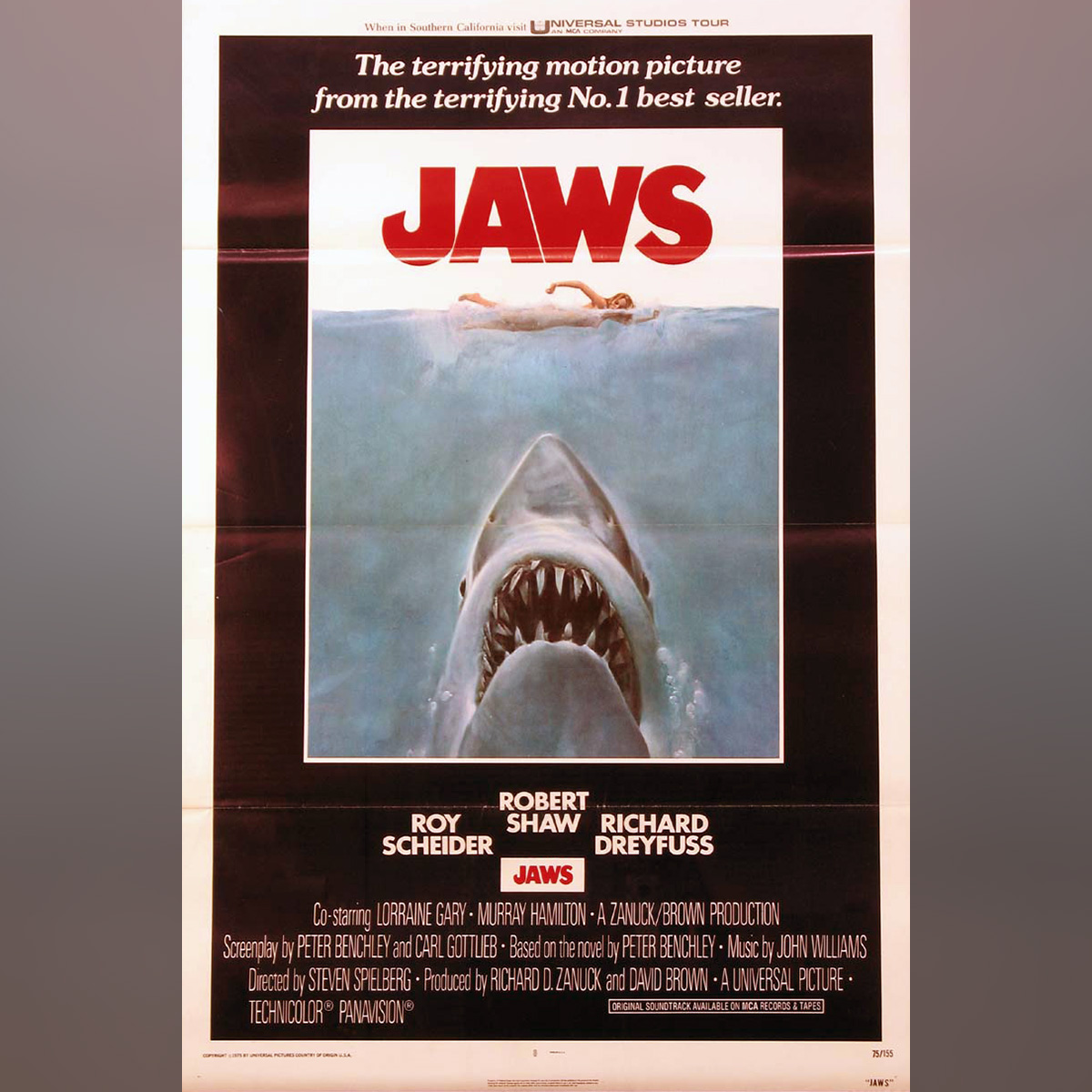 The artform still has its moments today, but I think a sizeable portion of the real treasure is to be found in an approximately 30-year period from 1945 to 1975, featuring ever more interesting and experimental graphics.
And the more you get into it, and look at international variants for classic American, British and European films, the more brilliantly inventive designs there are to be found. And for me, the fun is so often in the unfamiliar.
Saul Bass: Design Genius
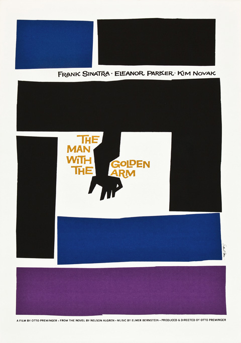
Enough already. Here’s the daddy. Genius is an over-used word. Saul Bass was a design genius.
Bass not only designed posters but also shot opening title sequences for many great films, including Alfred Hitchcock’s most successful Hollywood classics; he filmed the slinky black cat that introduces Edward Dmytryk’s Walk on the Wild Side; and he also worked extensively with director Otto Preminger, whose adaptation of Nelson Algren’s The Man with the Golden Arm saw Frank Sinatra’s junkie Frankie Machine struggling to stay clean. Typical Saul - deceptively simple and unforgettable.
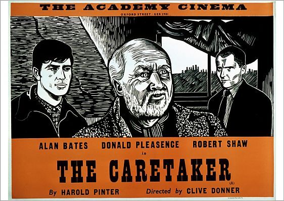
Wood and linocuts
Peter Strausfeld was a German immigrant in England, who worked exclusively for the (now sadly defunct) arthouse Academy Cinema in London. His signature style - wood and linocuts, limited use of colour - is immediately recognisable. The BFI’s online store has many of his posters for sale. Treat yourself.
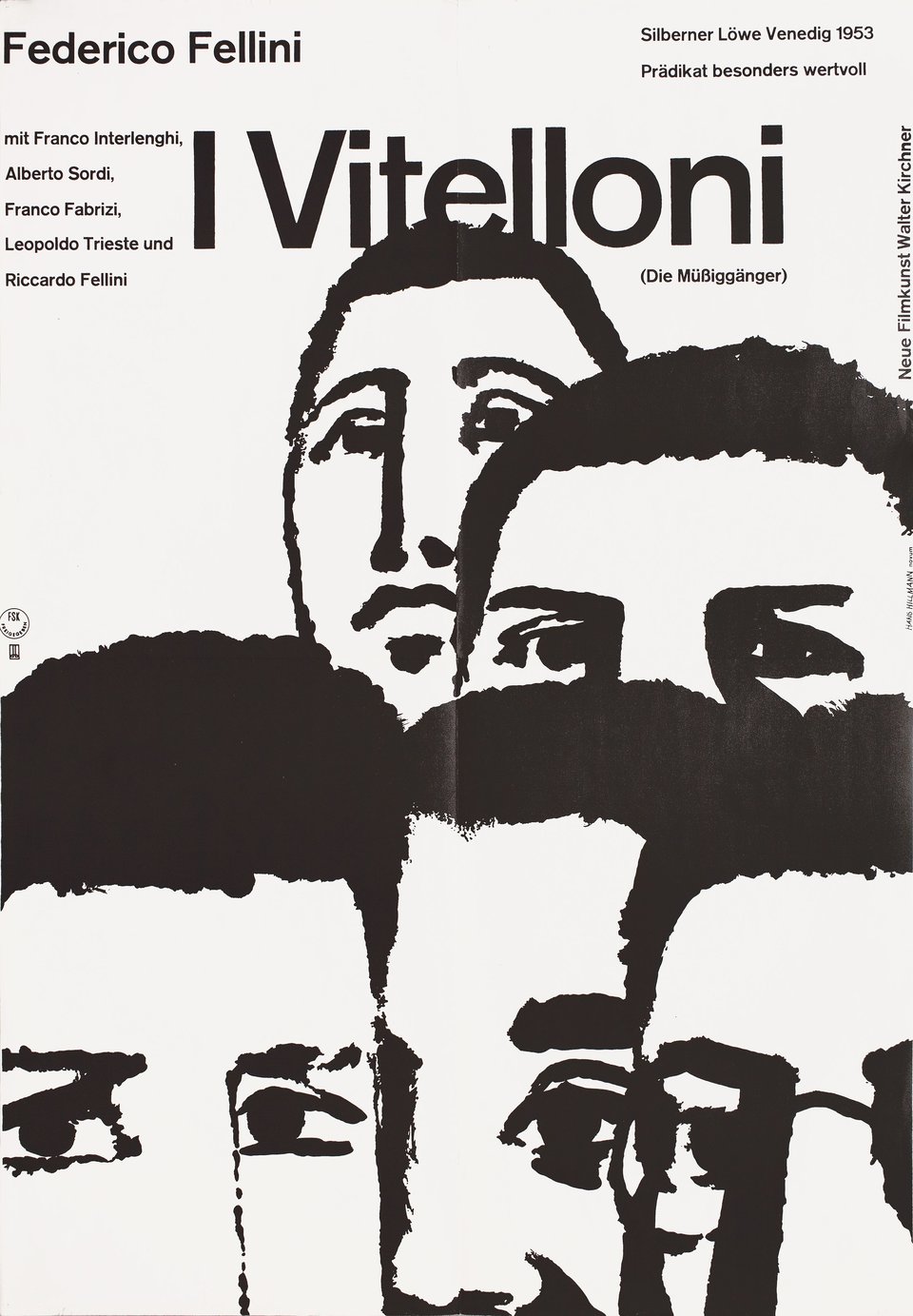
Another German artist, Hans Hillmann, worked for the distribution company Neue Filmkunst, and produced artwork for pictures by many of the great directors of world cinema, including this unusual piece for Fellini’s typically trying comedy-drama I Vitelloni (The Layabouts). Hillmann is really worth looking up. Full of surprises.
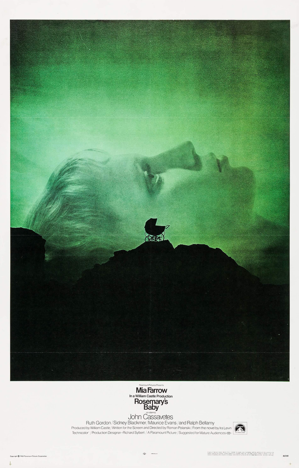
I love this image (below) for Roman Polanski’s horror Rosemary’s Baby by American artists Philip Gips and Stephen Frankfurt. It tells you a lot with very little.
I much prefer it to those collage images popular in the ‘70s that try to sell the entire story on a sheet of A2 (think Bond, Carry On, little details like women wearing next to nothing). Here there’s just Mia Farrow looking spooked, a pram in the foreground on a hill. I’ll say nothing in case you’ve never seen the film. You ought to.
Perfect Polish posters
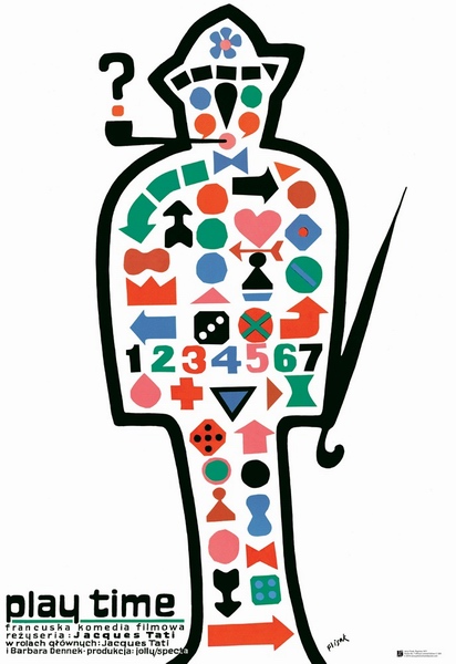
Going back to my point about depicting comedians on posters, France’s latterday silent funnyman Jacques Tati is a gift to the artist. Pipe, floppy hat, umbrella, raincoat. Poland has a long tradition of brilliant film posters, which often bear little or no relation to more familiar Western images.
In fact, if you twist my arm I’d say Polish film art of this era is probably the best of the lot. The Czechs were pretty good too, mind. Pole Jerzy Flisak’s poster for Tati’s futuristic 1967 masterpiece Play time is mildly weird and recognisably Tati at the same time.
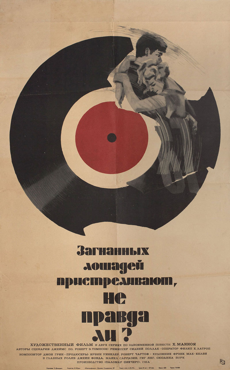
And now that genie’s out of the bottle, here’s another simple and distinctive Eastern European image. Russian Sergey Ignatevich Datskevich’s take on Sydney Pollack’s They Shoot Horses, Don’t They?, with Jane Fonda and Michael Sarrazin starring in the Depression-era marathon danceathon.
Eyecatching Italian art
And finally… I’ve barely scraped the surface here. There are so many wonderful designs to discover. This is one of the more striking, and unusually monochrome Italian posters I’ve seen, by Folco Lucarini and Angelo Novo, for Sergio Leone’s epic Once Upon a Time in the West. There are actually four images in total, with the subject in various stages of discomfort.
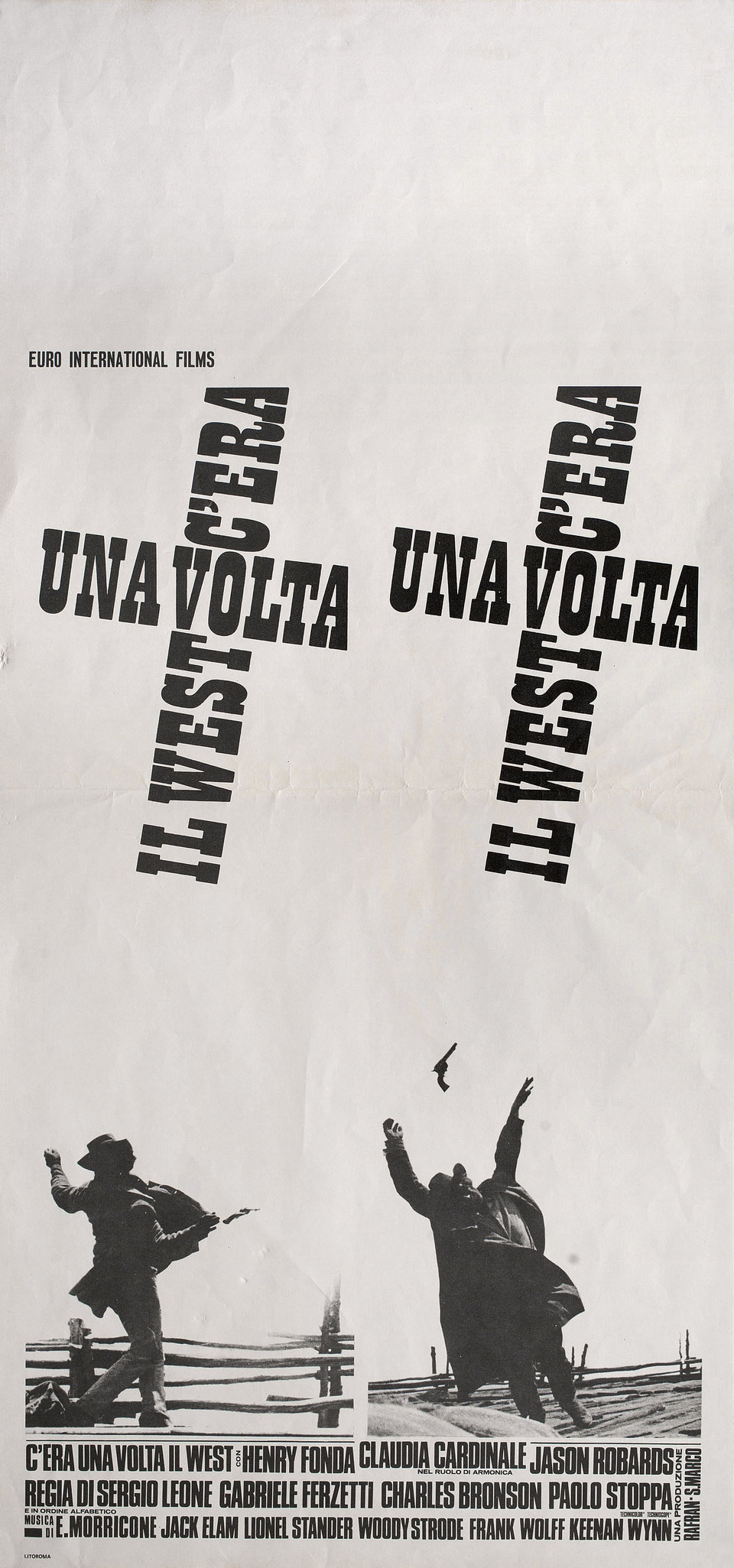
Must’ve looked a pretty eye-catching giant-sized quartet when displayed outside Italian picturehouses in 1968. Like the film, lots of space and more than a hint of violence.
If you’re thinking of buying posters, shop around. You can pay fortunes for originals, but there are plenty of decent reproductions available to buy online for a fraction of the price.
One book I strongly recommend, which focuses on the post-war period I rave about, is a hefty tome called Art of the Modern Movie Poster by Judith Salavetz, Spencer Drate and Sam Sarowitz (2008, Chronicle Books), if you can find it.
Also, the film streaming site MUBI has regular features on film posters on its Notebook page. Well worth a look.
See image links for copyright details.
